What Every Entrepreneur Should Know About Your Logo: 3 Types of Logo
Re-Post From: http://www.dotsign.com/internetmarketingideas/
![]() “Making a Mark” we all have heard this. But in a business world a logo is probably one of the very first tools that help you make that mark.
“Making a Mark” we all have heard this. But in a business world a logo is probably one of the very first tools that help you make that mark.
We had addressed the core 3 factors that must be considered when designing a logo earlier [Have you missed it? Click here to read].
Let us focus on the basic types of logo that will help you decide the form in which you would like to represent your identity.
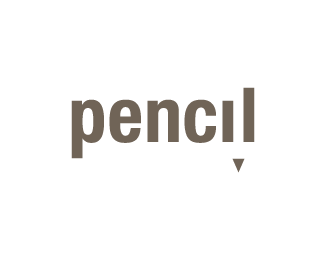
1. Wordmark : Also called “Typemark” logos are logo that are basically spelling out the company or business name but in a unique way. The type of font used, the styling and creativity incorporated, shape and size they all matter. A wordmark logo can very well convey a specific impression about your business
Script fonts imply a sense of formality and refinement. Thick fonts proclaim strength and power. Tilted or slanted type fonts impart a sense of motion or movement. Type font treatments can also include hand-drawn letters, characters or symbols that have been rendered in such a way as to intrigue the eye and capture the interest.
Above all one important fact that needs to be kept in mind in a wordmark logo is “readability”.
Some of my recent favorites .

2. Icons / Symbols: Think of Mercedes, Apple, Shell, Nike etc? What you see is an icon a simple symbol that is compelling yet uncomplicated.
 There are 2 sub categories. The images can be
• Direct icon
• Abstract
Symbols may not be as straight forward like a Wordmark style logo in communicating the business name but they definitely take the words out of the picture and reach your subconscious mind with a symbol that needs no words.
The key here is to “Keep it Simple”.
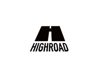
3. Combination Marks: Combination marks are a hybrid of the Wordmark and Iconic logo types. You can and must have a balance of the symbol that you want your targets to remember when they think about your business and also you can spell out your business name. Make sure you keep focus keep it simple.
Do not let your graphic designer get carried away because you might end up with a illustrative story board as your logo and not a single focused brand identity. Few popular ones that you might have noticed are Starbucks, Pringles, Dominos pizza etc.
 BAD examples:Confusing, complicated and try putting these on a promotional T shirt
Few GOOD combination style logo that you may not have seen.


Graphic designers are great but having JUST a graphic designer design your logo sometime is not advisable. The logo design MUST be smart and thought from an integrated marketing point of view.
DotSign can help with your brand blueprint, marketing consultant, graphic designers and web specialists too. Logo is not a standalone tool – You think you deserve the best? Call DotSign – 313 799 3263.
———————————— Contributed by —————————————————

Branding | Web Design | Web Software | Web Marketing | Mobile Marketing
Phone: 1.313.799.3263 |1.313.79 WEB ME | http://www.dot-sign.com
| Topic | Replies | Likes | Views | Participants | Last Reply |
|---|---|---|---|---|---|
| NoWhoUR a lesson in authentic branding | 0 | 0 | 73 | ||
| Getting Ish Done | 0 | 0 | 273 | ||
| Get Better at Communicating NOW | 1 | 0 | 352 |